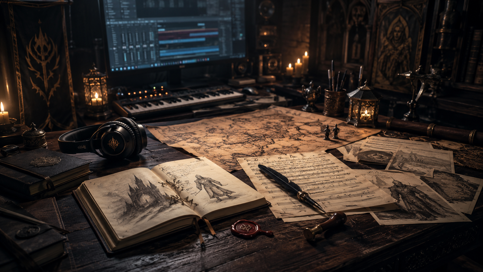
Teutarya’s Herald is not meant to look like a normal blog.
The idea behind the website is closer to a dark-fantasy archive: a place where songs, chroniclesThe Chronicles are written fragments, lore entries, characte..., lore fragments, and project updates can appear as parts of a larger world.
Why an archive style?
TeutaryaTeutarya is the dark-fantasy music and lore universe behind ... is a music-first project, but the songs point toward something larger. They feel like fragments of a myth — moments from battles, courts, oaths, lost places, and stories between lightLight is the Aether aspect of binding, order, oath, protecti... and shadowShadow is the Aether aspect of rupture, hunger, secrecy, dec....
That is why the website needs to feel more like a chronicle than a simple news page.
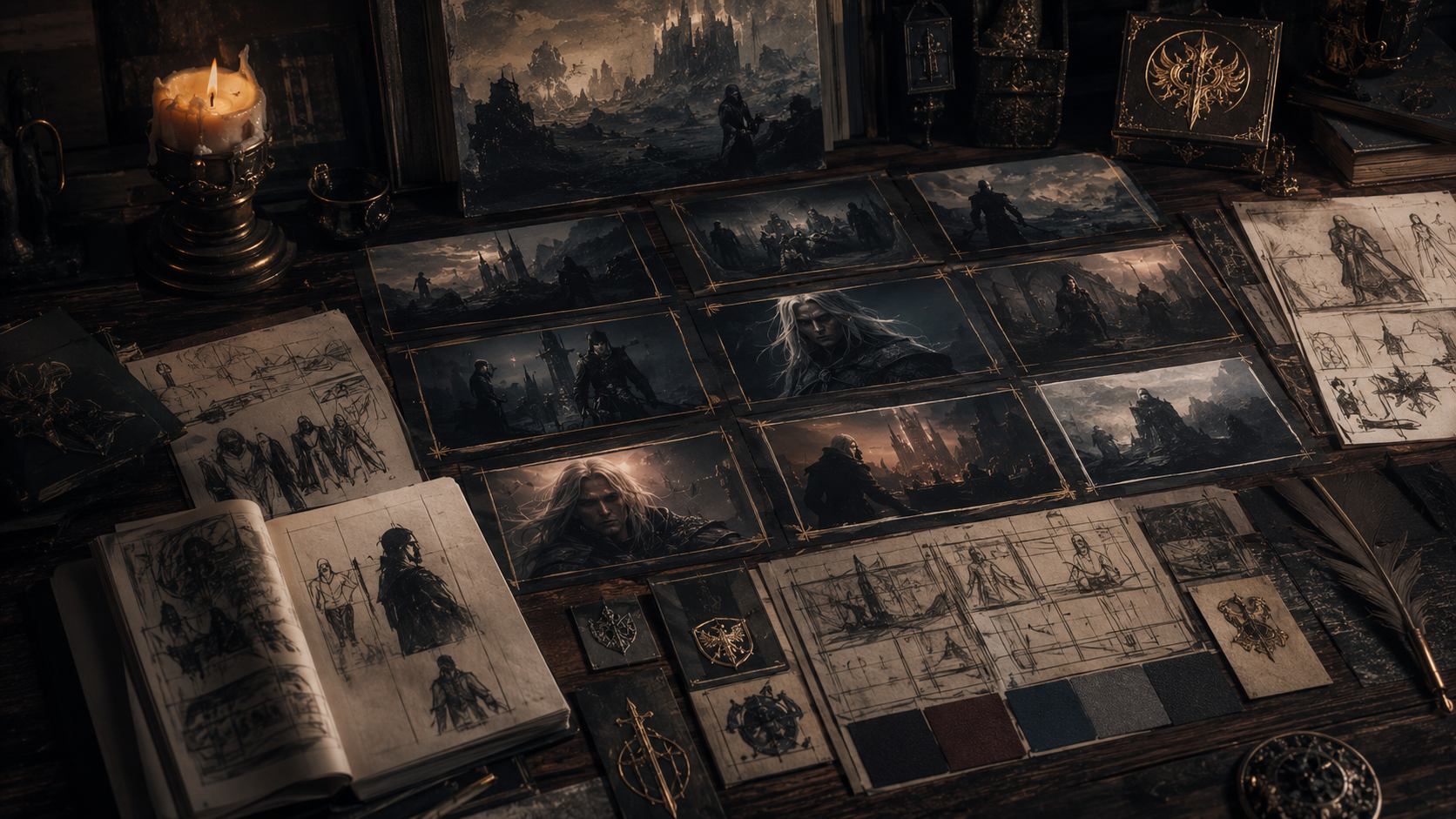
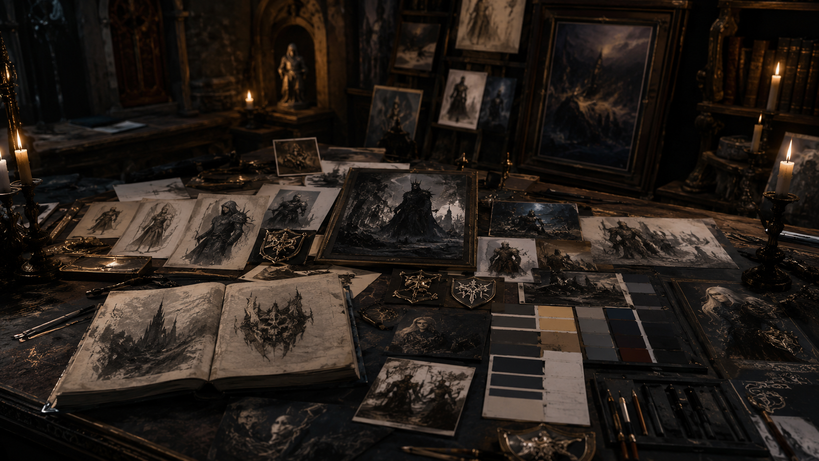
The visual direction
The current direction combines:
- dark editorial layouts
- atmospheric featured images
- old chronicle and herald influences
- cinematic dark-fantasy realism
- muted colors, stone, parchment, gold, shadowShadow is the Aether aspect of rupture, hunger, secrecy, dec..., and mist
The goal is not to overwhelm the visitor with effects. The goal is to create a calm, mysterious entry point into the world.
A living archive
The design will continue to evolve as the project grows.
New songs, stories, lore entries, and behind-the-scenes posts will shape the visual identity over time. The website is not a finished monument. It is an archive being opened.